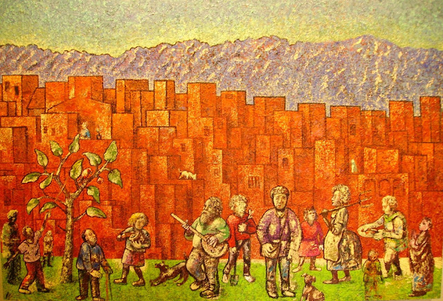
Current state. The colors are far less blue. I'm thinking about calling it
first day of spring. Lots more detail and definition.
-------------------------------------------------------------------------------------------------------
This is the current status of the painting under discussion here, after considerable work this week:
A friend of mine said that the orange part looked to him like a wall, not a city. I do think of it both ways, and I think of a wall as in some ways a symbolic way of representing a city. Here is another painting I've been working on for some time where the large expanse in the middle is more explicitly a wall, but for me it also symbolizes "city"...
There is a kind of cubist texture to both these wall-city paintings. In the orange painting that is on the easel right now (well, actually both paintngs are on the easel at the moment) I am working layer by layer, trying to both intensify and deepen the orange color while also develop the cubistic urban texture.
The mountains and sky have a color feel that reminds me a little bit of Rockwell Kent...
The orange 'city' is sort of a cubistic version of the way painters in Italy would depict a city prior to the Renaissance...
... I have a lot of work to do to develop the urban texture.
There is also a Rothko aspect to what I am trying to do with this painting...
In a way I am most interested in developing glowing swathes of color.
I'm far from sure what this painting is about, but it has to have a working title. The color is more vivid than I am used to working with. It's perhaps a sort of apocalyptic picnic. Possibly a better title - apocalyptic picnic. It's largish - three feet by four feet. I think it needs more characters in the forefront.


