Saturday, August 25, 2018

Currently On the Easel: Escape from The City


Current state.  The colors are far less blue.  I'm thinking about calling it 
first day of spring.  Lots more detail and definition.


-------------------------------------------------------------------------------------------------------

This is the current status of the painting under discussion here, after considerable work this week:

A friend of mine said that the orange part looked to him like a wall, not a city.   I do think of it both ways, and I think of a wall as in some ways a symbolic way of representing a city.  Here is another painting I've been working on for some time where the large expanse in the middle is more explicitly a wall, but for me it also symbolizes "city"...
There is a kind of cubist texture to both these wall-city paintings.  In the orange painting that is on the easel right now (well, actually both paintngs are on the easel at the moment) I am working layer by layer, trying to both intensify and deepen the orange color while also develop the cubistic urban texture.

The mountains and sky have a color feel that reminds me a little bit of Rockwell Kent...
The orange 'city' is sort of a cubistic version of the way painters in Italy would depict a city prior to the Renaissance...
... I have a lot of work to do to develop the urban texture.

There is also a Rothko aspect to what I am trying to do with this painting...

In a way I am most interested in developing glowing swathes of color.
----------------------------------------------------------------------

I'm far from sure what this painting is about, but it has to have a working title.  The color is more vivid than I am used to working with.  It's perhaps a sort of apocalyptic picnic.  Possibly a better title - apocalyptic picnic.   It's largish - three feet by four feet.  I think it needs more characters in the forefront.

Saturday, August 18, 2018

The Many Sides of Joey Like

No artist in Bloomington is more exciting to follow from show to show than Joey Like.   Joey Like’s  work changes dramatically from show to show, though always following a thread.  At the same time Joey’s work evokes shamanic visions and early generation video games.  Joey Like’s work is rooted in Bauhause and De Stijl.  HIs commitment to flatness emphasizes texture and color space. 

Joey Like’s current show at the Bellevue Gallery at the Farmer House Museum offers four small triptychs.  The use of this medieval European format seems to signal, not for the first time for Joey Like, an interest in building bridges between his modernist sensibilities and ancient traditions.  Joey Like’s paintings are triptychs, but they are also masks, or depictdions of masks, or inspired by masks.    Each is accompanied by photographs, also arranged in triptych form, touch on some of LIke’s other influences in these paintings,  enigmatically titled:

Mask of the Promoted,

Mask of the Descendant,

Mask of the Journeyman,

Mask of the Travelor.

On one level these paintings read as lovely explorations of color.  Natural colors.  Clay red,  Chaulk white.  Black eyed susan yellow. These colors soothe the eyes.  Used in symbolic masks, they seem to speak of natural change,  Scrubbed and rubbed colors seem  to speak of the same, like colors made from muds and rubbed into people’s faces.

Mask of the Traveler:


This mask seems focused  and experienced.  At the same time, it seems to be open, drawing in information.  It seems to await some indication.

Mask  of the Journeyman:


This mask’s open mouth and sensitive nose and narrowed eyes seem to indicate that it is focused on absorbing information, committed to a particular path.  It seems committed, but at the same time anxious and uncertain.  The path is chosen but still unknown.


Mask of the Descendant:


This mask seems to convey that the person it adorns has withdrawn from everyday concerns, perhaps seeking some shamanic wisdom to strengthen and inform the bearer’s commitment to a chosen path.  This mask seems to suggest  that someone is far away, but will soon return.

Mask of the Promoted:


For Joey Like, yellow seems to be a color that symbolizes rebirth.  Compared with Joey’s other masks, this seems to represent a character who is unformed.  But light shines from the eyes and this seems to convey hope.

Thank you Joey Like for an exhibit of paintings that is beautiful, and sobering.


Saturday, December 23, 2017

Article in the HT about my double show...

Thank you Bloomington Herald Times for covering my current show with a nice article...


I wondered if people would find my double show just very strange, arbitrary, self-indulgent, hard to understand.  As far as I can tell, that's not a problem at all for people.  It seems to make good sense to people.  I think the work itself explains the approach I took, which is how it is supposed to work.

Thank you HT and Jenny Porter Tilley.

Tuesday, December 12, 2017

Paintings and Palaver: Paul Kane discusses his Dec. 2017 show...

This is my first attempt to make a video of myself discussing a show, with the help of Madelyn Ritroski (thank you Madelyn!)...

It went pretty well for a first attempt, but you can tell I was very nervous when we did the video!  I mean I'm always goofy but I'm super goofy here.  Still I kind of like it and Dave Colman's comments at the end are brilliant. Colman co-runs The Venue Fine Art and Gifts gallery with Gabe Colman and always has something really insightful to say about art in his gallery.

This is an interview with Paul Kane done by Jared Winslow last spring...
Thank you Jared.

This is a slide show I created for my Dec. 2017 show...


...I seem to be learning, little by little, about the multi-media world, even though I'm generally more comfortable with a paint brush in my hand!

The show continues through December!


Wednesday, December 6, 2017

The Yin Yang of a Bilocation Show

Madelyn Ritroski took some great pictures of the current show at the  Bellevue Gallery at the Farmer House Museum, showing the Bellevue's part of Paul Kane's bi-location show PAINTINGISDEADLONGLIVEPAINTING.

The Bellevue Gallery is an artists' coop, a gallery run by artists for artists.   Its first exhibit was in 1987, so 2017 is the 30th anniversary of the Bellevue Gallery.  Although the Bellevue's existence has been peripatetic, it currently resides at the Farmer House Museum, where it presumably has a permanent (and cozy) home.


The other wing of Paul Kane's bilocation show, PAINTINGISDEADLONGLIVEPAINTING, is at The Venue Fine Art and Gifts ...
The Venue Fine Art and Gifts

Hosting Paul Kane's show at two locations allows a yin yang sensibility to express itself, where darker paintings are on display at The Bellevue and more whimsical paintings are on display at The Venue Fine Art and Gifts....
The Venue Fine Art and Gifts


 The Bellevue wing of PAINTINGISDEADLONGLIVEPAINTING is darker, thematically but still full of light.  This is probably the darkest painting in the show...

I think it is partly about the cruelty of life, but it is also about something like shamanic transformation.

Both wings of PAINTINGISDEADLONGLIVEPAINTING are cozy and encourage spending time with paintings...


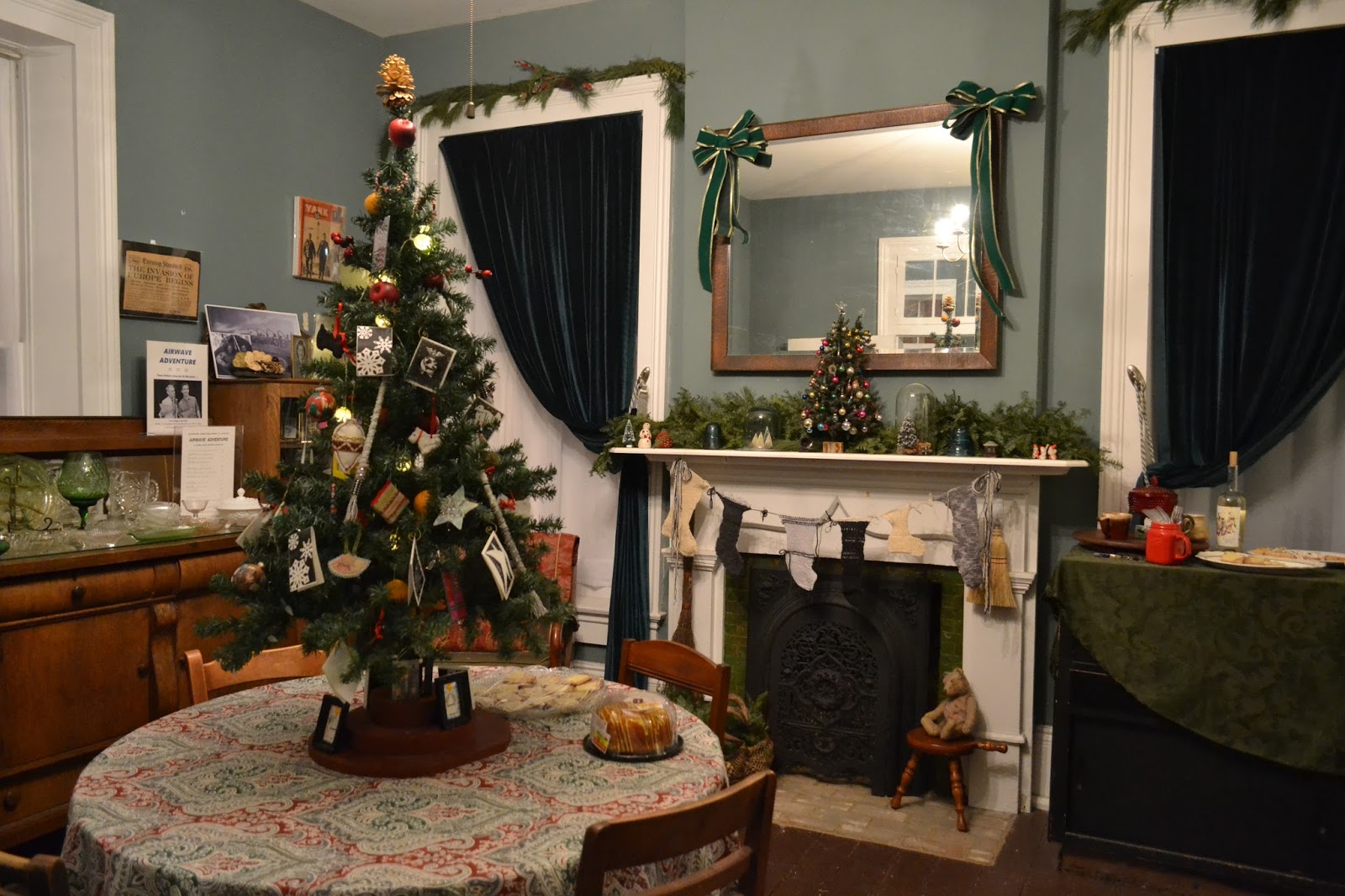
Farmer House Museum curator Emily Purcell has created a beautiful and very complimentary holiday display, which features an Artisan Tree, covered with ornaments made by Bellevue Gallery artists, which can be purchased ...


Spend part of your holiday by the friendly hearth at the Farmer House Museum!


Sunday, November 26, 2017

Celebrate the Birthday of Painting Everyday!

My December painting show, opening at The Venue Fine Art and Gifts and The Bellevue Gallery at the Farmer House Museum (both in Bloomington, Indiana), entitled PAINTINGISDEADLONGLIVEPAINTING, is the best and most important show I have done.


 It's a statement about the importance of painting not only in art history but also today and in the future.  Many of the paintings in the show are homages to famous paintings from the 'traditional' canon of art history, though you don't have to know this to appreciate the paintings.  They celebrate what for a long time was known as THE Tradition and now is known more appropriately as A Tradition.  They also poke a little bit of fun.

For example, this painting is an homage to a painting by Cezanne...
Making a Point, by Paul Kane


I wanted to achieve the same feeling that Cezanne achieves (I think), that these two men have been meeting this way a long time.  With Cezanne one gets the feeling that the two guys never talk.  My two characters talk a lot I think.

I think of the paintings in my December show as fairy tales.  The beautiful thing about fairy tales is that they can be very sweet and playful, but they can also  be very dark.   I explore both sides in this show, sometimes in the same painting, sometimes in separate paintings.

This is one of my favorite paintings in the show...

Dragon Wagon by Paul Kane

Why is a centaur boy pulling a child dragon through an enchanted forest in a little red wagon with his father looking on protectively?  Only in dreams can that be explained.

Another painting in my show seems to me more mythological, or even shamanic...

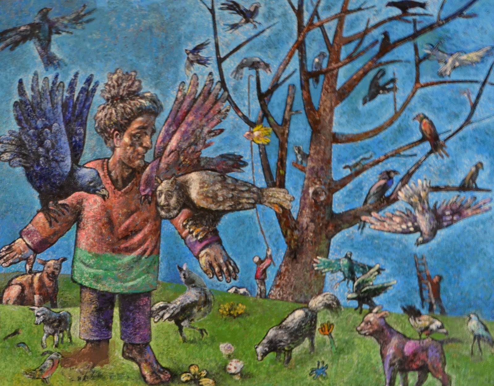
Learning to Fly by Paul Kane

I think of the painting as depicting a gathering of birds (and other animals) whose purpose is to remind human beings of their connection to nature.


This painting is the largest in the show at four feet by five feet...

Blinded by the Light by Paul Kane

I see it as possibly a gathering of people around some tragedy, or  perhaps around a religious/shamanic moment, such as Saint Paul struck to the ground on the way to Damascus.

Showing in two locations allows one location, The Venue Fine Art and Gifts, to focus more on  more whimsical work, while the other location, The Bellevue Gallery at the Farmer House Museum, focuses more on darker themes.  Neither side is entirely dark or light, though.  The balance between dark and light might lean one way or the other, but there is always a balance.

Friday, November 24, 2017

Boogie Woogie Tribute to Mondrian


Here is the Mondrian picture I had in mind...


My picture doesn't have the airiness typical of Mondrian, but I think that was part of my inspiration.  This painting is perhaps the least airy of Mondrian's paintings, seeming almost crowded, full of movement, the blocks jostling each other.